
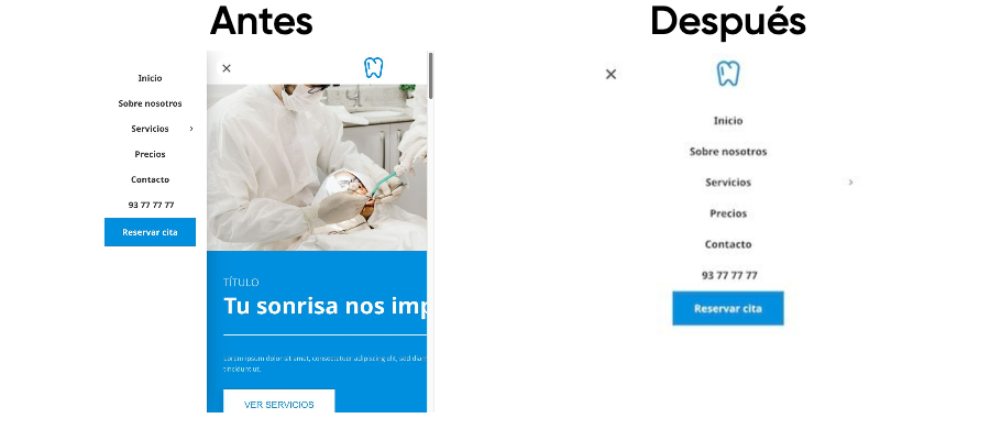
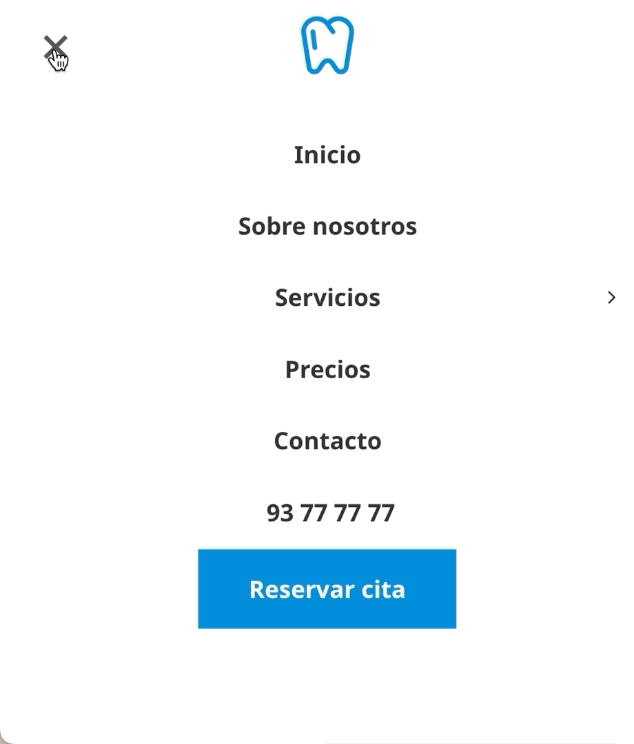
Menú móvil a pantalla completa
móvil | menú | CSS | completo
Última actualización
móvil | menú | CSS | completo
Última actualización
@media (max-width: 768px){
  .open > .content, .mobile-header-wrapper {
    	top: 60px !important; /*Modifícalo para ajustar la altura */
  }
  .open .header-wrapper, .open>.content, .open .mobile-menu {
        left: 0!important;
    	position: fixed; /*evita el scroll de la página cuando el menú está abierto*/
  }
  .open .mobile-header-wrapper {
  		visibility: visible;
        opacity: 1;
        -webkit-transition: opacity .3s ease;
    	   -moz-transition: opacity .3s ease;
    	        transition: opacity .3s ease;
  }
  .mobile-header-wrapper, .mobile-popup nav {
        width: 100%;
        visibility: hidden;
        opacity: 0;
        left: 0;
      	-webkit-transition: visibility 0s 1s, opacity .3s ease;
    	   -moz-transition: visibility 0s 1s, opacity .3s ease;
          	    transition: visibility 0s 1s, opacity .3s ease;
        -webkit-box-shadow: none;
    	   -moz-box-shadow: none;
    	        box-shadow: none;
  }
  /*El texto con los enlaces del menú quedan centrados*/
  .mobile-header-wrapper .header-widget .text-widget-content {
    	text-align: center;
  }
}